
Today we're launching a big improvement in how Neolace lets you visualize and explore your data using graphs. There are two main changes that we're rolling out together: a better layout algorithm and a way to add more entries to the graph interactively. I'll show some examples of each.
The new layout algorithm
First, let's look at an example from the "PlantDB" dataset that we use for Neolace development. Here is how the graph of two species entries (Ponderosa Pine and "Western Redcedar"), along with their ancestor entries, used to look:
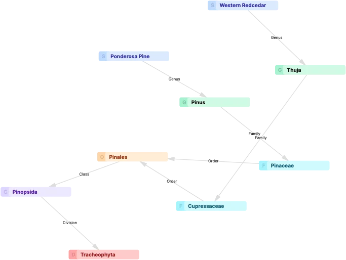
Now, technically this graph shows how Ponderosa Pine and Western Redcedar are relate to each other, along with their taxonomy. However, it's hard to read at a glance because the entries are arranged seemingly randomly. The problem is that the layout algorithm we used (a force-directed layout) is not semantic - it ignores the meaning of the relationships between the nodes and treats all the nodes as peers. Before you can really interpret such a graph, it's often necessary to spend some time to manually drag the nodes around until they are arranged more sensibly.
Here's how the same data now appears in the latest version of Neolace:
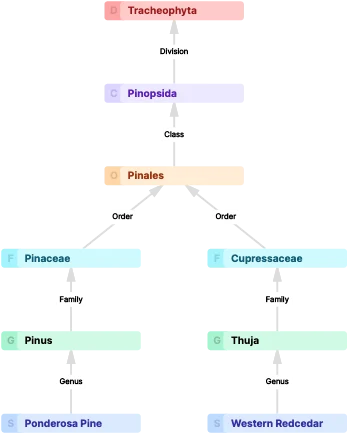
It's much more obvious how the entries here related to each other. You can read it at a glance, and you don't have to drag nodes around before the visualization is useful. The layout for this new graph is done with the "Dagre" layout algorithm originally developed by Chris Pettitt. This algorithm uses the meaningful "X is a subclass of Y" relationships that exist among the entries to arrange them in a typical tree/DAG structure.
The reason we haven't used the Dagre layout algorithm before now is that it only works for hierarchical relationships. If you have non-hierarchical relationships among your entries, then it's a poor choice. And since Neolace aims to support a very wide range of use cases, we definitely cannot assume that all relationships among entries are hierarchical. Luckily, Neolace actually knows which relationships are hierarchical and which ones aren't. So the solution that we've settled on is to combine both layout algorithms. First, the Dagre layout is used wherever there are hierarchical relationships among the entries. Then, the rest of the nodes are positioned using the classic force-directed algorithm. We've carefully tuned this combination layout algorithm so it should produce useful layouts by default across a wide range of use cases.
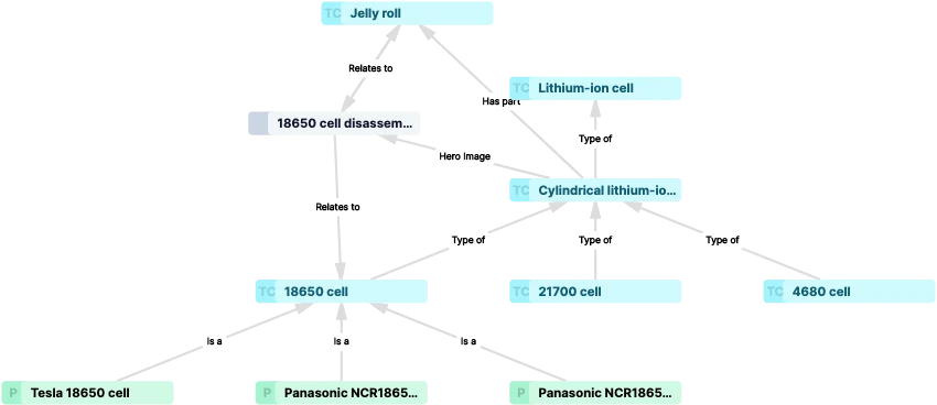
Here's an example from TechNotes, where you can see the combination layout. The two nodes near the upper left, "18650 cell disassembled" and "Jelly roll", have been positioned using the force-directed layout, while the dagre layout was used for the other hierarchically related entries.
Node streaming
The other new feature is called node streaming. Until now, to graph some data in Neolace, you had to write a lookup expression (like this.andAncestors().graph()), and then you'd see a graph of whatever entries resulted from that lookup. But the point of these graph visualizations is to help you explore and discover relationships among the entries, and that requires a more dynamic approach. Starting today, you still load the initial set of entries the same way, but we display "placeholder" entries ("ghost nodes") on the graph to show you any connected entries that haven't been included in graph. Then you can simply click on them to load them into your graph. You can repeat this as needed to "stream" as many entries into the graph as you'd like:
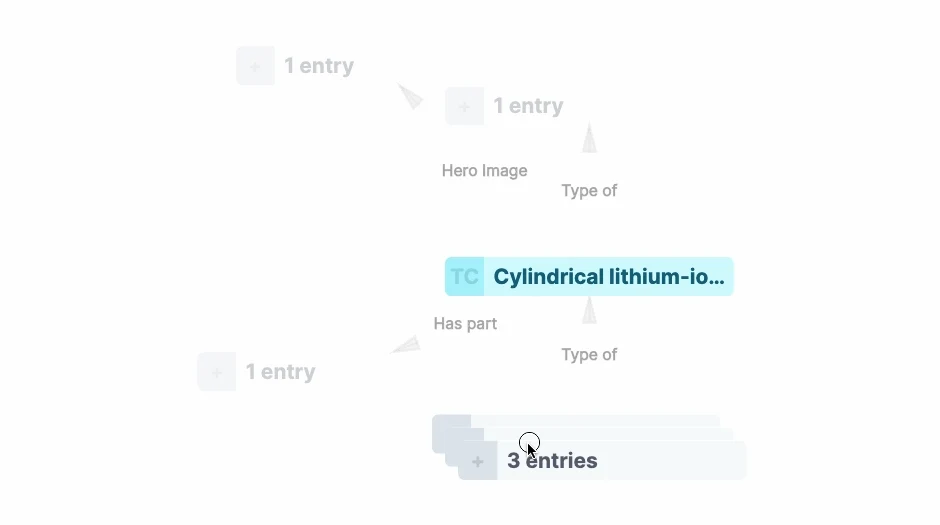
Note: if you want to hide these placeholders from the graph, there is a new toggle on the graph toolbar that allows you to turn them off.
Demo
The images above are just screenshots; here's a small demo that you can interact with:
For more detailed examples, check out these graphs on TechNotes:
- Graph of a single entry, "Cylindrical lithium-ion cell" - good demo of streaming in additional nodes
- Graph of "Monocable Gondola" and related entries - good demo of hierarchical relationships
Next steps
We know there's still a lot of room for improvement in our graph layout algorithm and tooling. We have a huge backlog of features to build for you, and we're also conducting ongoing research to develop even more effective layout strategies.